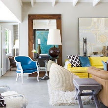
good room designs start from the top and finish at the bottom, leaving no details untouched.
isn't the dark molding fantastic in this room!
here's a different view. it really shows off the architectural detail and sets the mood for the room.
and this cute nursery. vibrant as it can be.
here's a shot of the mural on the ceiling. now, i'm not a mural's #1 fan, but this is cute for a nursery.
especially with that light fixture.
do you like the wood paneled ceiling that mirrors the floors?
what a great way to bring light into this dark kitchen. what a unique home!
so remember, keep your head up. you never know what you might see!
1,2,3,4 color theory5 urban dwellings
6 decor pad


I love the black trim but I love the nursery it is so so beautiful :)
ReplyDeletethe skylight over the dining table is stunning. Imagine if it rains and standing under that? It must be total zen. (or am i the only one that loves that kind of thing!?)
ReplyDeletei agree with the comment above i love the black trims so very smart , and the wooden floors.
ReplyDeleteAndrea- Romantiques furniture Art Studio