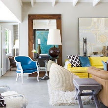
this is an example of one of my favorite design elements. traditional/victorian exterior with a modern interior.
these pops of orange are beauty
love the entryway chandelier and that railing.
i would love to have this shower
this house is pretty neutral with the same color pops mixed throughout the entire house.
to see more photos, check out houzz


Woooowww Alison! I love this... I want one, I want one! This is an awesome house, I'm loving the simple white with just punches of citrus... soooo pretty! Thanks friend.
ReplyDeleteI absolutely love orange and this home has incorporated the color in the most perfect way. Boy would I like to see it in person!!
ReplyDeletexoxo,
Carrie
I'am in love!!!!!!! The orange made my heart skip a beat!
ReplyDeleteAbsolutely adore that interior-clean lines, minimalist, and that orange...love it! are you getting some inspiration for your new home???
ReplyDeletenaina
I love when something you expect to look a certain way turns out to look completely oposite of that.
ReplyDeleteThis house has the feeling to it, and they have done a great job.
Thank you for sharing :o)
xoxo Nicole Lisa
http://www.blushcode.com/
ive never been a huge fan of orange but i really like this one! it has just the right amount of spice to it. and i totally agree with you--that chandelier and bathroom are both amazing!
ReplyDeleteCLOTHESURE
Love that orange wall...and that shower is divine!
ReplyDeleteI love the pops of orange!! Amazing!! xoxo
ReplyDeleteHow cool to find such an unexpected modern and edited interior in such a classic shell! Somehow it all works!
ReplyDelete2 and 7! We think the same :) And I as well have the same dilemma! Somehow I spend entirely too much money in there haha Also...I have to say this hoouse is perfection- pretty on the inside and out!
ReplyDelete